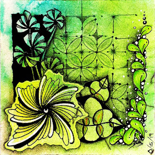
Patterns: Kngihtsbridge and Nzeppel
No Animal Happy Day today. It is getting dark and I still haven't watered the gardens yet. You guessed it, I am in a hurry!!! So off you go you little skinny page....
Just another Tangle Site
Refresher #203 published August 9th, 2019 on tanglepatterns.com featuring the tangles Flux, Bysomnus, Tufton, Z'ele, and Capz. It app...

I, Susie Ngamsuwan, own this site and I waive all copyrights ©
Love it - has a wonderful contras Susie :-))
ReplyDeleteThank you for your kind comment, Gudrun.
DeleteNeat sorta Mondrian feel to it!
ReplyDeleteHa! You hit the nail on the head. Thanks, Trudi, I take that anytime. Next time I add the colors, too.
DeleteLove the highlights on your Nzepple, it really makes it look like stones. And very nice detail on the shadow underneath your curling fescue! Very pretty!
ReplyDeleteThanks so much for your kind comment, Lisa.
DeleteI don't find this a "skinny" page. Sometimes less is more and I can say that of this drawing. I like it, especially the beautifull highlights you put on N'Zeppel.It is a nice compositon with lovely contrasts!
ReplyDeleteThanks, Ria. I actually drew 2 tiles, but the first went straight to the bin. I wonder where my head was last week...and still is. Definitely not in the tangle world.
DeleteI like your reduced interpretation of Joey's challenge. The contrasting light Knightsbridge and Nzeppel are looking very interesting with the highlights.
ReplyDeleteThanks, Margarete, for your kind comment. I am your perfect opposite. You burst with tangle ideas while I struggle. The above is a 'struggle' result.
DeletePretty..... love the accents of your squares...
ReplyDeleteOh mai, thanks so much on for your kind comment, luv.
DeleteLovely!
ReplyDeleteThanks, Susan.
DeleteLove this. Very different "take" on Knightsbridge. I often find Knightsbridge to be fun to do but somehow it tends to look the same every time one does it--but what you've done here is incredibly imaginative.
ReplyDeleteThanks, Meridiana. It is a modest tile with modest tangles, but sometimes it is the KISS method that makes something stand out. I fully agree with you concerning knightsbridge, but for its simple checkered flag base pattern it gives you tons of design possibilities, literally!
Delete